
The Power of Color Psychology in Branding and Design
In branding, every detail matters. From your choice of color, logo design and typography to the layout and imagery on your website. One of the most powerful and often overlooked elements in this equation is color. The colors you choose for your brand can significantly impact how customers perceive your business, making color psychology a key consideration in branding and design.
Color psychology explores how different colors evoke emotions and influence behavior. Understanding these associations can help businesses—especially small ones—make smarter choices about their branding, leading to stronger connections with their target audience. So, how do you harness the power of color to build your brand identity?
1. Why Colors Matter in Branding
Colors have a profound psychological effect on people. They influence mood, perceptions, and even purchasing decisions. In fact, research suggests that up to 90% of people’s initial judgments about a product can be based on color alone. That’s because certain colors evoke specific emotional responses. For small businesses, understanding this connection can help create a stronger, more cohesive brand that resonates with customers.
When you use color thoughtfully, it can:
- Convey your brand’s personality
- Evoke certain emotions and reactions
- Influence consumer behavior (e.g., impulse buying)
- Build brand recognition
2. The Psychology of Colors: What Each Color Represents
Each color has a unique set of associations, and choosing the right one for your brand depends on the emotions or messages you want to convey. Let’s break down some common colors and their psychological impacts:
Red: Excitement, Passion, Energy
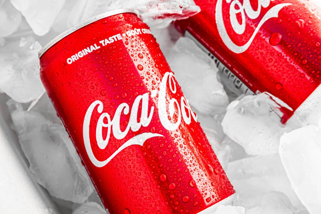
Red is a color that grabs attention. It’s bold, powerful, and intense. It often symbolizes passion, excitement, and urgency. Red is commonly used in industries where energy, action, and boldness are key (e.g., food, entertainment, sports). It’s also used in sales or clearance promotions to create a sense of urgency.
Example Brands: Coca-Cola, Target, McDonald’s
Blue: Trust, Calm, Professionalism
Blue is known for its calming and soothing effects. It symbolizes trust, security, and professionalism. Many financial institutions, healthcare providers, and technology companies use blue to convey reliability and competence. Blue tends to resonate well with consumers who are seeking stability and dependability.
Example Brands: IBM, Facebook, American Express
Yellow: Optimism, Happiness, Creativity

Yellow is a color that exudes warmth, positivity, and energy. It’s often associated with happiness, optimism, and creativity. This color can stimulate the brain and evoke feelings of joy and innovation. Small businesses in creative industries or those aiming to evoke an upbeat and energetic vibe may benefit from incorporating yellow into their branding.
Example Brands: McDonald’s (yellow in their logo), Best Buy, Snapchat
Green: Health, Growth, Sustainability
Green is often connected to nature, health, and wellness. It’s a color that symbolizes growth, renewal, and sustainability. Brands in the health, wellness, and eco-friendly sectors often use green to communicate their commitment to these values. Green can also be associated with financial growth, making it a good choice for businesses in banking and real estate.
Example Brands: Whole Foods, Starbucks, The Body Shop
Orange: Creativity, Fun, Adventure
Orange is a vibrant and energetic color that embodies enthusiasm, creativity, and fun. It’s often used by businesses that want to create a sense of excitement or adventure. Like red, orange can be bold, but it’s a bit friendlier and more approachable. It’s effective for companies in the entertainment, food, and retail sectors.
Example Brands: Nickelodeon, Fanta, Home Depot
Purple: Luxury, Royalty, Mystery
Purple is a color associated with luxury, sophistication, and royalty. It has a calming effect but also conveys a sense of mystery and creativity. For small businesses that want to appeal to a higher-end market or emphasize creativity and uniqueness, purple can be a strong choice.
Example Brands: Hallmark, Crown Royal, Yahoo!
Black: Elegance, Power, Authority
Black is a powerful, classic color often associated with elegance, authority, and sophistication. It’s used by high-end brands that want to project an image of luxury, exclusivity, or professionalism. When used strategically, black can create a sleek, modern feel that appeals to discerning customers.
Example Brands: Chanel, Nike, Audi
White: Simplicity, Purity, Cleanliness
White is often used to represent simplicity, cleanliness, and purity. It gives a sense of space and clarity. White is often used by brands in the tech, health, and beauty industries, where clarity and simplicity are valued. It can also be used to balance more intense or bold colors.
Example Brands: Apple, Adidas, Tesla
3. How to Choose the Right Color Palette for Your Brand
Now that you understand what each color represents, it’s time to select the right palette for your business. Here are a few steps to guide you in choosing colors that align with your brand’s identity:
1. Understand Your Brand Personality
What kind of business are you running? Is it fun and playful, or is it professional and sophisticated? Your brand personality should influence your color choices. A creative agency might opt for vibrant colors to communicate creativity, while a law firm might choose blue and gray to convey professionalism and trust.
2. Know Your Audience
Think about who your target audience is and what kind of emotional response you want to evoke in them. For example, if your target market is young, vibrant, and energetic, you might use bright colors like yellow or orange. If your audience is older and more conservative, you might opt for neutral tones like blue or gray.
3. Use Color to Tell Your Brand Story
Your brand colors should reflect your business’s mission and values. If sustainability is central to your business, green could be an important part of your palette. If your focus is on high-end luxury products, a black and gold color scheme may better suit your brand.
4. Keep It Simple and Consistent
Too many colors can make your branding feel cluttered and confusing. It’s best to choose a primary color and one or two complementary secondary colors. Consistency is key—using the same colors across your website, social media, and marketing materials helps create a cohesive brand image.
4. Color in Practice: Examples of Strong Brand Palettes
Many well-known brands use color to their advantage:
- Coca-Cola: The bold red color exudes energy and excitement, appealing to consumers who are looking for refreshment and fun.
- Apple: The sleek use of white, gray, and black communicates a sense of luxury, simplicity, and modernity.
- Spotify: The bright green and black color scheme evokes energy and creativity while remaining sophisticated.
Conclusion
Color is more than just an aesthetic choice; it’s a powerful psychological tool that can shape how consumers perceive your brand. By understanding the emotions and associations behind different colors, small businesses can make informed decisions that reflect their values, connect with their audience, and differentiate themselves from competitors.
So, whether you’re starting from scratch or rebranding, take the time to choose your colors wisely. The right palette can turn a simple logo into a memorable brand, foster loyalty, and set the stage for long-term success.


Leave a Reply